Huse Case Study
Design Challenge Outline
A problem that kept coming up when talking to artists is that there was no way to sell directly to fans and that newer artists cannot get any exposure. I wanted to create a platform where artists can post what they want and it would not get buried in the other content, and they can sell directly to fans, cutting out the middle man. Huse is an app designed for artists to share and promote their unique pieces and sell their work to fans directly.
I believe that artist are having a difficult time selling their work on social media platforms because they are not geared to cater to them. I know I am right when the data shows that they have made little to no money directly through the platforms
Key Research Findings
Research was done mainly through interviews with artists that were affected by this challenge, and secondary sources helped to cement and corroborate the information that they gave. The research showed that there were 3 main aspects that people had issues with when it came to other media sharing apps.
-

Mental Health
Mental health. The pressure of having to constantly output content just to stay on the radar is draining artist have said. Having to regularly create something just to appease an algorithm affects people in negative ways and in a few articles states that it “kills” creativity.
-

Discoverability
it is harder for new artists to be discovered. New artists cannot get a foothold into the market which is dominated by larger artists or influencers. The only real way is to pander to what the latest fad is rather than making what the artist wants.
-

Commerce
There’s no real way to make money off other platforms. A lot of artists want to be able to sell directly to a fan rather than linking them to a separate website. Most of their money is made through commissions which comes with its own set of hurdles.
Opportunity Selection
With these three issues,there were many opportunites to explore. Each issue touched upon something that most artists had to deal with. There is an opportunity to improve on all these aspects
How Might We…?
How might we help smaller artists sell their works directly to fans so that they can make a profit in an easier way?
Task Selection
I chose tasks that dealt with the commerce side of the issue. More ideas were popping into my head about it, from the the interviews, being able to make money directly was an issue that was universal across all the interviews. I mainly focused on directly purchasing a piece and how to commission an artist.
Sketchs and Wireframes

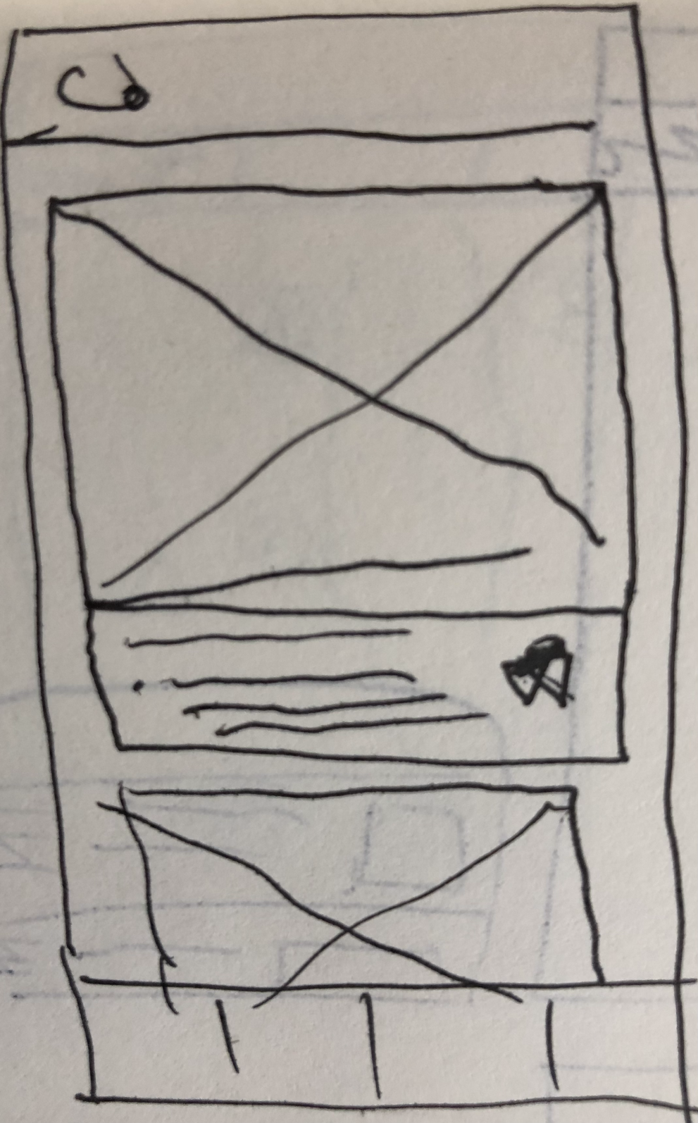


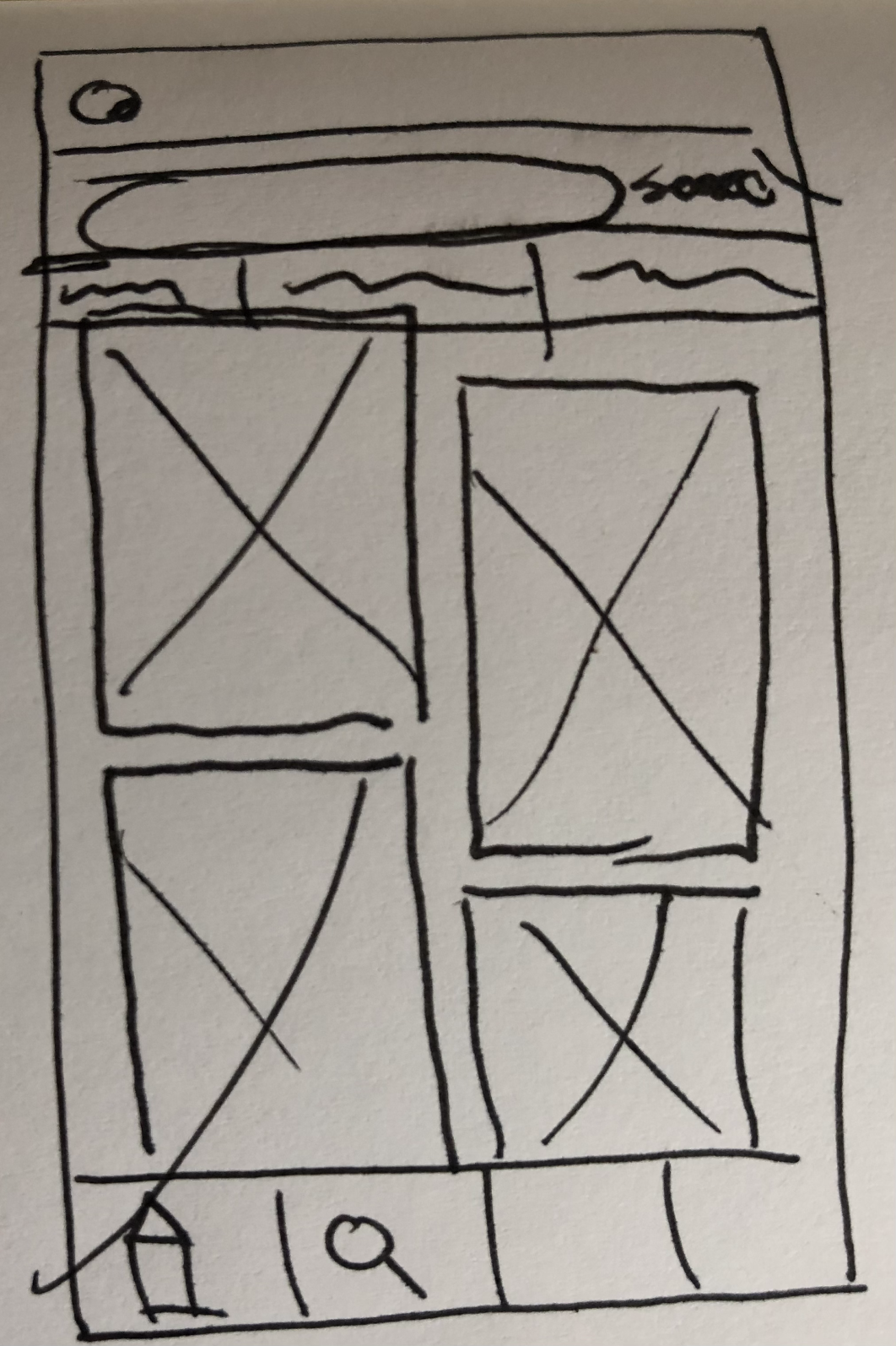
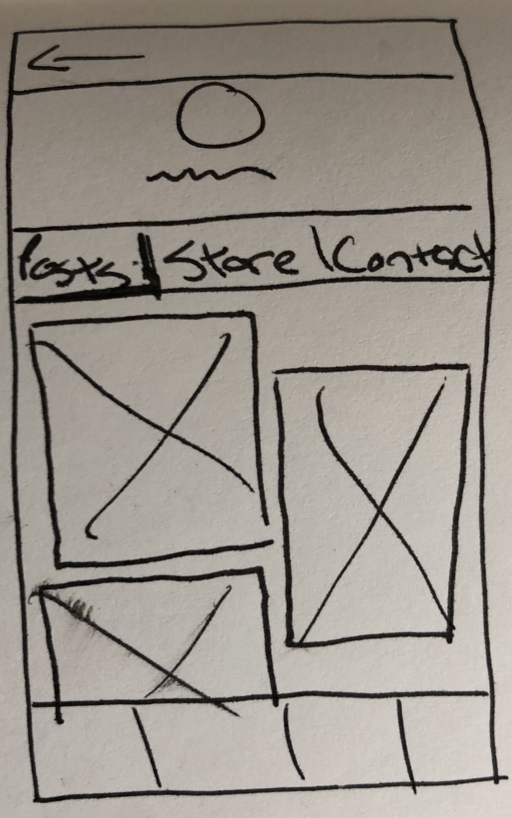


Overall, the platform changed from sketches to wireframe to greyscale. With each iteration, the concept was tested to make sure it made sense. Some parts changed drastically due to tester feedback (such as the commission system), enhancing the feature and making a better product. Each iteration improved on the process of buying art from an artist but what drastically improved was how users and artists communicated and negotiated with each other, the process was streamlined and improved.

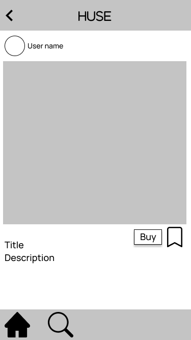


Hi-Fidelity Colour Mockup
After each iteration of testing and improving the wireframe, we finally get the full colour mock up! Now this is far from the final version (further testing and iterations are still planned), but it does show the culmination of this process of going through the BrainStation course.
Visual Identity Story
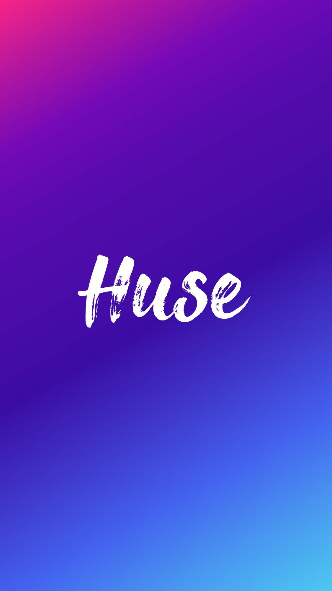
The reason I chose the name of Huse is that I wanted a term having to do with art. After going through a few names I fused the words hue and muse together Huse. I figured this was a good name seeing the hue has to do with colours and muse is for inspiration. With Hue being part of the name I wanted the brand colours to be bright, radiant and something that stands out. I chose a gradient of neon colours (pink to blue) since they stand out and the typography looks like it was painted on.







Product Marketing Website
The website shows the mockup on different devices and promotes the features that separate it from the other social media site. It also talks about the values we espouse and where to download the app.
Multi-Platform Challenge
I chose to create a desktop version of the platform. The decision was between a tablet and desktop because most tend to use either to create art. I chose desktop since the chances are higher that artists tend use it to create, having better software to do so.
Design Impact/Future Thinking
With this platform I hope the impact is that more artist leave other social media sites and embrace Huse. It’ll be easier for them to make a profit, easier to gain a following on this platform. For the future, a major thing coming up are NFTs. Having a system that can help artists take over the space in a larger and impactful way is the next step. An idea would be having an auction system where artists can sell an NFT piece to the highest bidding. The system would need safeguards so that all parties can conduct this process with integrity and safely. Designing an auction system will be the next iteration of the Huse platform. Further testing and refinement is also part of the future plan.
Key Project Learnings
The key learning for me was how truly important testing is. I used to think that more people created something after copious amounts of studying and research, they would create a design based on their learnings and with minimal testing. Testing is very important and at least for me, testers were able to spot things I overlooked or gave amazing ideas that helped to improve the idea (not to mention the fact it was incredible to see people use the prototype and watch them give great ideas and insight).


